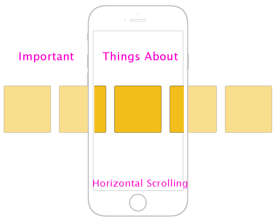
Even though vertical scrolling is the standard, we’ve seen a lot of websites implementing horizontal scrolling in the past couple of years. However, horizontal navigation is still seen as a nuisance when it comes to web design. Despite that, we’re seeing signs of significant changes and potential use of this approach.
Web design keeps evolving, and designers want to create breathtaking sites that give something new. Even though this type of navigation isn’t new, it has been blacklisted for a long time. Today we’ll talk about how this concept works and where it’s being reintroduced in the design world.
Page navigation explained
Before we talk about anything else, let’s get back to the basics. Page navigation refers to moving through web pages and their resources fitted into hypertext and hypermedia. Page users use a user interface (web browser) to navigate the pages.
As the people from BANG Website Design, a Phoenix web design company, like to say: “Page navigation is a crucial part of web design that offers maximum useability of online content and makes it easy for visitors to find exactly what they need.”
Professionals use different navigation methods and systems to establish intuitive pages with simple structure. Page navigation is often referred to as local navigation as it helps users navigate through a specific site section.
Horizontal scrolling explained
Horizontal scrolling is a page navigation system used by designers. This system allows various page functionalities while letting users scroll pages from left to right to get more information through information windows and containers.
Scroll bars are placed horizontally, and users can click & drag them with a cursor left and right or do this with their finger if using a mobile device. Mobile users can also use horizontal scrolling by swiping the screen sideways or with a trackpad.
Desktop users can also move horizontally using their left and right keys. Newer websites usually have vertical navigation, but many horizontal scrolling applications are growing.
Differences between horizontal and vertical scrolling
It’s easy to recognize what type of scrolling the page has. You just have to look at the scroll bar orientation. Here’s what you need to know:
- Horizontal bars have a horizontal placement and can move the screen to the right or left;
- Vertical bars have a vertical placement and move the screen down or up.
Mobile device users usually don’t see any bars since they use a touchscreen to navigate through the screen. For them, it’s about trying to move the screen up and down or left and right to see what kind of navigation the page has.
Simply put, the only difference between these two methods is where you can move the screen. Apart from that, they offer identical functionalities.
When to use horizontal scrolling
There’s a reason horizontal scrolling is ignored – there aren’t many situations where you can use it effectively. However, this doesn’t mean that it’s not better than vertical scrolling in some cases.
For example, it’s an excellent option for showcasing images or other visual information in large areas with separate sections and discreet slides. It offers a much better user experience, especially when trying to show an extensive product catalog or many items in different categories.
You can show the categories horizontally but expand the page vertically so that users can stay on the same page. Whenever you have to display multiple images quickly in a non-intrusive way, you can use horizontal scrolling.
When to avoid horizontal scrolling
The content reached with horizontal scrolling is usually hidden. In some situations, the page itself doesn’t offer the right hints about what kind of content is hidden and that it can be revealed with horizontal scrolling.
Given that the vertical method is a standard implemented on most websites, most users aren’t used to it. In other words, the whole page navigation will feel unnatural to users without a clear sign that there’s horizontal navigation.
You shouldn’t use horizontal scrolling on whole pages
Even though horizontal scrolling has many different applications on isolated page sections, it can’t replace vertical scrolling for full pages. People are used to this already established convention and simply expect it.
User experience is about habits, and most people use websites with horizontal navigation. However, you can use it for various sections we mentioned earlier. At the same time, you can consider adding triggered horizontal scrolling animations to give your web pages more flavor.
Conclusion
Even though horizontal scrolling isn’t the main thing in web design, it shouldn’t be overlooked. Use it wherever it makes sense to make your pages more unique and improve user experience. Just be sure to plan out your site and implement this method properly.
Also Read:

