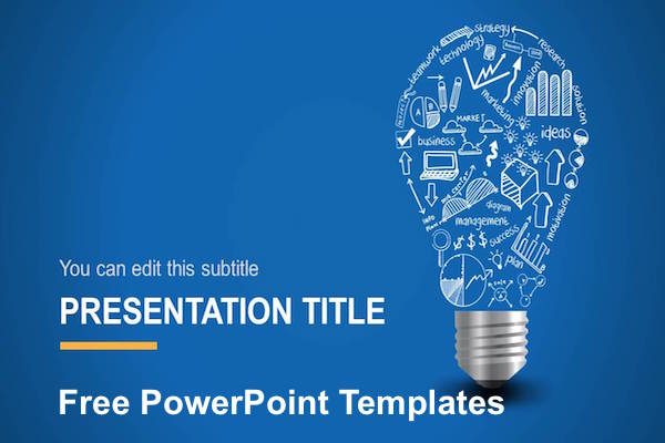
An excellent presentation design can be difficult to master because it requires a smart combination of many elements, including colors, fonts, images, icons, and backgrounds. It is also necessary to control the amount of these elements so as not to overload the presentation. So, in this article, we will look at 4 basic “rules” of creating perfect presentations. They relate to the following elements: the background image, text positioning, font and type, placement of images and shadows.
4 Design Tips for PowerPoint Presentations/ PowerPoint Templates
Tip #1
A background picture should be in one color with the whole presentation. For example, if the part of the background image will be dark violet and another part will be white, then the text will have to “match” two different colors to make it readable and stylish. Also, the background image should not be variegated. For example, to place a bright picture on the background is a big mistake because the text will have to be placed in a separate box. However, in some cases, such an option is good to use, especially when you need to focus attention of the audience on the particular picture or graphical element.
Tip #2
If you place a large amount of text on a slide, you should justify it. In case there is not so much textual content, it can be placed around the picture or any other objects. In this case you will concentrate attention of the audience both on visual and textual components of the slide making the information convey the maximum effective.
Tip #3
Remember that no matter how much information you are going to place on the slide, the font size should be no less than 18-point! However, if you want to make a presentation strictly according to all rules, the font size should be 20-32-point. What’s more, the advisable amount of text on a single slide is approximately 10-20 words.
Tip #4
Try to choose the maximum clear font for your presentation. The most commonly used fonts are Arial, Calibri, Times New Roman, Verdana, and Tahoma. However, if you need to highlight a certain keyword or a title, you can use more “creative” options for fonts, such as Freestyle Script, Gigi, and Monotype Corsiva among many others. In case you do not like any of the suggested font options, you can download the desired font from the Internet and install it on your computer. But remember, if in the future you have to show this presentation on another computer with no such font, it will automatically be replaced with other existing fonts by default. As a consequence, many of the words can be changed in size, overlap other objects, etc. So consider choosing the font with the utmost seriousness.
Final Conclusion:
So as you have understood, creating a presentation can be quite challenging task. And if you have doubts about preparing an effective presentation yourself, then you can open the media library of PoweredTemplate offering hundreds of masterfully-crafted PowerPoint templates. There you can find a PowerPoint product for any taste and purpose, featuring different visual effects and designs. What is more, you can cooperate with the company graphic and presentation designers in order to create an authentic template to meet your specific needs only. Further, the company offers a client-oriented customer support able to assist you in any question, whether technical or financial.

